As with any project, marketing your book can require lots of time and effort. Even after you publish the book itself, you still have to get your name out there so readers can easily find your published work.
Generally, having an author website to link to can help you achieve that goal, but you don’t need a complex multi-page website to generate leads. Instead, you can create one page where readers can buy your book, learn more about your work, and purchase it right away.
So, without further ado, let’s cover all that you need to know about creating a captivating book landing page in more detail.

What Is a Book Landing Page?
A book landing page is a webpage where readers can learn more about your book and have the option to purchase it. This can be a simple page that displays only your book cover, description, and button to purchase the book. Alternatively, it can contain all kinds of teasers and additional content to motivate readers to buy the book.
While there are many ways to create a website for your book landing page, the easiest one would be to use a website-building tool like WordPress or Squarespace to quickly get the job done. You can alternatively hire professional web designers if you do not have the time or resources to build the website yourself.
Why Should You Create a Book Landing Page?
There are many benefits you can gain from creating a landing page for your book. One of them is that you will be able to showcase your months of hard work to potential readers. After all, if you’ve gone to such lengths to publish your book, why not invest as much effort in marketing it?
Not only that, but an effective book landing page also does the following:
- Can turn your target audience into loyal readers: Most book landing pages contain snippets of information that describe the book’s contents. When well-written, this content can make readers curious about the book and encourage them to consider buying it.
- Allows room for design flexibility: Unlike social media sites, most website creation tools, you can design your landing page however you wish. Whether it’s repositioning elements like the book cover, description, or CTA, you have complete control over the design. This flexibility ensures you can tailor your landing page to your specific needs and preferences.
- Makes analytics tracking easier: The best part of having a landing page for your book is that you only need to direct readers to one page. As a result, you can simply track analytics such as click-through and conversion rates for one page to measure its effectiveness.
- Boosts your professional image as an author: Generally, a well-designed webpage helps readers trust the credibility of your work. So, having a book landing page that looks clean and professional will help you present your author brand as a reputable one.
- Boosts your on-page SEO: Finally, a book landing page is a very important page for your book’s online presence as it helps readers find your book easily via search engine results. To increase the visibility and discoverability of your book’s page, you should follow SEO best practices to ensure that your book has a higher chance of being discovered.
The Essential Building Blocks of a Good Book Landing Page
Now that we have covered why you should have a book landing page, let’s move on to how you can make one. To keep things simple, we won’t talk about the technical aspects of building a website. Instead, we will talk about four key elements you need to think about: headline, book cover, web content, and the call-to-action.
1. A Clear, Eye-Catching Headline
The first thing readers will notice about your book landing page is the headline. For this reason, it’s quite important to spend some time thinking about what you’ll be titling your landing page. For simplicity’s sake, most authors use their book titles as the headline for their landing pages.
However, it may not always make sense to use your book title as a headline, especially if it’s vague. In such situations, try writing a headline in a similar style to slogans or blog articles’ titles. Sometimes, you might want to use the second-person perspective (addressing readers using “you”). This helps readers feel like the words on your page are speaking directly to them, which can grab their attention and keep them engaged.
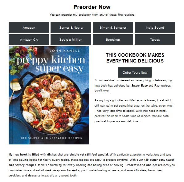
In the following example, John Kanell’s Preppy Kitchen Super Easy: 100 Simple and Versatile Recipes uses a simple headline: This cookbook makes everything delicious. As a slogan type of headline, it’s clear, straightforward, and advertises what the cookbook does.
2. High-Quality Book Cover and a Matching Page Design
To capture potential readers’ attention, your book cover must stand out on the landing page. To effectively showcase your book cover on your landing page, try using the same color palette for the page’s design as your cover (or colors that complement it well). You can also use the cover design as a theme for the entire page.
Don’t forget to compress the cover image file as much as possible when uploading it to your landing page without compromising quality. That way, the browser loads the page and the image faster, preventing readers from clicking away in disinterest because the page is loading slowly.
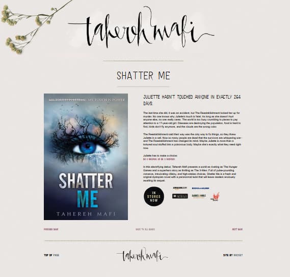
Some authors make their covers one of the centerpieces of their landing pages, as Tahereh Mafi did with her bestseller Shatter Me.
3. Clear and Concise Information about the Book
Here is where you tell your target audience more details about your book: what makes it unique, or how it can help them with specific problems they are facing. If you have a non-fiction book, you can use an informational tone to convince readers about the importance of your chosen topic. And if you have a fiction one, you can rely on concept art to showcase the world of your fiction work. Just make sure that the writing style is suitable for your target audience.
With all that said, let’s take a look at a few content ideas for your book landing page. While all of the following ideas can appear on the same landing page, feel free to choose the ones most relevant to your book to avoid clutter.
A Compelling Book Description
Think of what your book has to offer to your readers. Is it a thrilling novel that will hook readers from the first page? Or maybe you had a breakthrough and came up with a great new strategy to deal with garden weeds?
Whatever it is, make sure you talk about the selling point of your book without spoiling it. Reveal just enough information to pique readers’ interest, leaving them wanting more and wanting to buy the book.
Important read: Secrets of Writing a Book Description That Sells
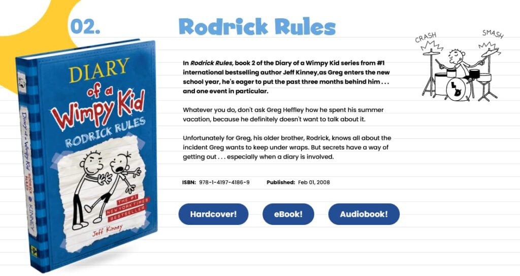
Take Diary of a Wimpy Kid: Rodrick Rules as a stellar example of giving away just enough to hook you into buying a copy.
Sample Chapters or Sneak Peeks
For both fiction and non-fiction books, sneak peeks are a great way for readers to get a glimpse at your book’s contents before purchasing it. If they find that they are interested in the premise of your book, they will be more likely to buy it.
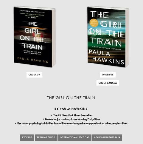
Recognizing the importance of this, Paula Hawkins, author of The Girl on the Train, adds an excerpt that can be read before buying her novel.
Author Bio
An author bio can go a long way in familiarizing readers with your background as an author. When you introduce yourself and list your relevant credentials or experience, you turn from a mysterious persona behind the screen to a real, relatable human being in your potential readers’ minds. So, they feel they can start to trust your expertise as an author and, in the end, the quality of your book.
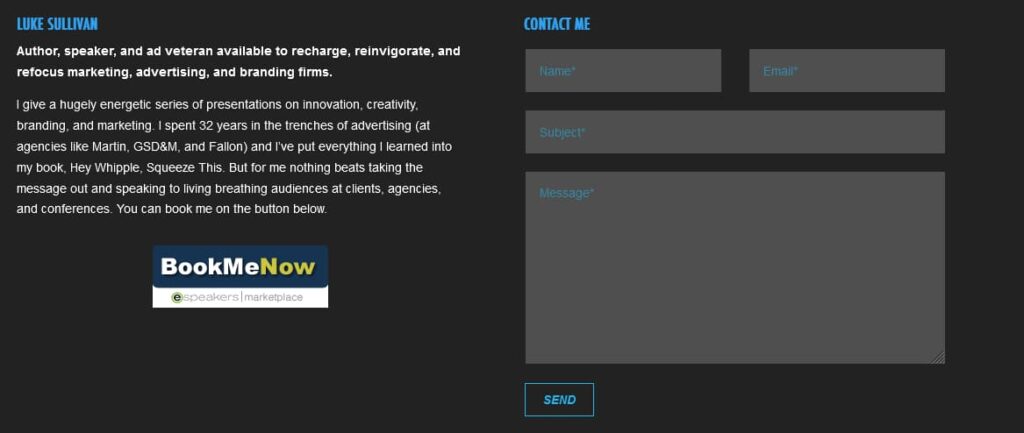
As an example, Luke Sullivan, author of Hey Whipple, Squeeze This!, includes a short autobiography next to a contact form, as you can see below:
Customer Reviews and Testimonials
Sometimes, your target audience might not feel ready to give your book a chance until they read others’ reviews on it. This is because personal experience is a powerful motivator that can convince people to make buying decisions.
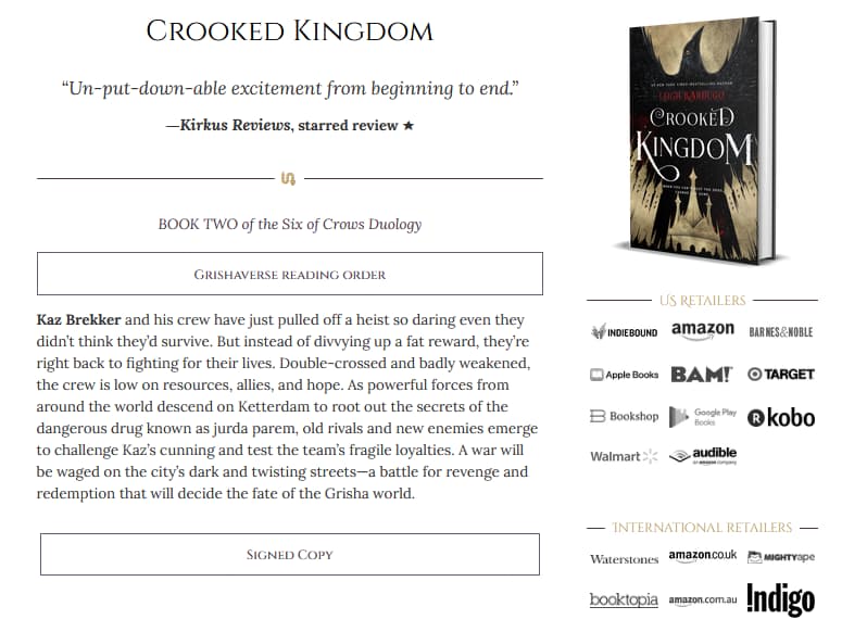
By displaying top reviews for your book on your landing page, you’re gently pulling readers towards that “buy now” button.
The landing page for Crooked Kingdom by Leigh Bardugo does just that.
Multimedia Content
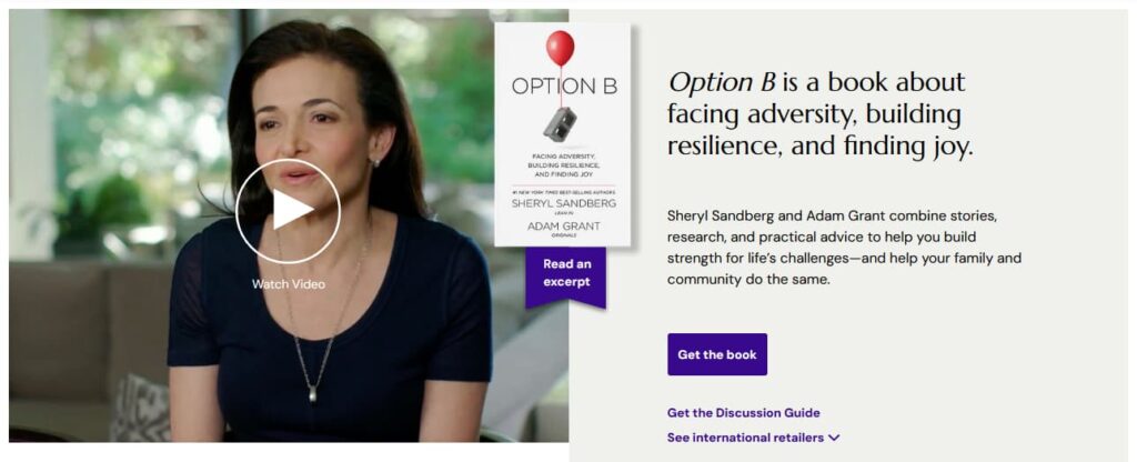
Nobody said your content has to consist only of text! Many landing pages use videos, slideshows, or even fancy website animations to create a unique sensory experience for their website visitors. You can also add a trailer for your book to get readers invested in it.
To see this in action, check out the landing page for Option B: Facing Adversity, Building Resilience, and Finding Joy by Sheryl Sandberg and Adam Grant. On the page, there’s a video featuring an interview with the authors and people who have shared their personal stories of grief and resilience.
4. A Clever Call-to-Action Button or Link
At last, we arrive at the central focus of the book landing page: the call to action. A call to action, or CTA, prompts the audience to take a particular action, like buying a product or subscribing to a service. In the case of a book landing page, the CTA is a button or link that readers can press to buy your book.
Just like other aspects of the book landing page, the placement of the CTA depends on the contents of the page. Most authors place their CTA after the book description. Usually, this means that the CTA is placed at the center or is slightly lower on the page. Thus, readers don’t lose line of sight with the CTA even as they explore and interact with the rest of the page’s contents.
On another note, when adding CTAs on a page, it is generally recommended to limit the number to one or two. This is especially important if the CTAs have different goals, such as purchasing a book or signing up for a newsletter. However, if all the CTAs have the same goal, such as purchasing the book, then it may be acceptable to add more. Furthermore, the CTAs you do add need to have clear and concise text that pushes readers toward that goal. For further inspiration, take a look at the examples below.
On the landing page for The Lucifer Effect by Philip Zimbardo, you will find a straightforward CTA that reads “Buy the book”. It does its job as efficiently as possible, reflecting a no-nonsense attitude that the author has taken with the rest of the page’s content as well. Furthermore, there is only one button to buy the book from so readers don’t get overwhelmed by multiple links.

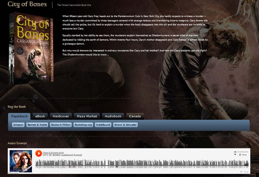
Another example is the landing page for City of Bones by Cassandra Clare. On this page, there are several CTAs, each linking to different platforms that readers can buy the book from. This way, readers can choose the publishing platform and book format they prefer.
Extra Notes on Crafting Book Landing Pages
There is no one right way to design the perfect book landing page. Yours will need custom adjustments according to the design and content of the book as well as the recommended SEO best practices.
With that said, here are a few final words of advice before you get started on your own landing page:
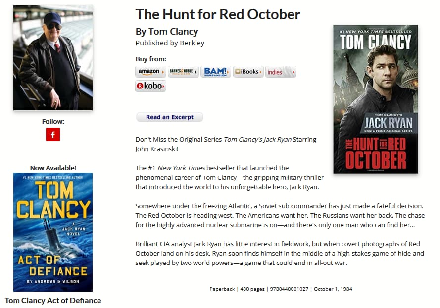
- You don’t have to follow conventional designs and templates. You have lots of freedom to experiment with your page to see which arrangement of content generates more leads. For example, the landing page for The Hunt for Red October by Tom Clancy starts with a headline followed immediately by several CTAs, then an excerpt, and finally the book description.
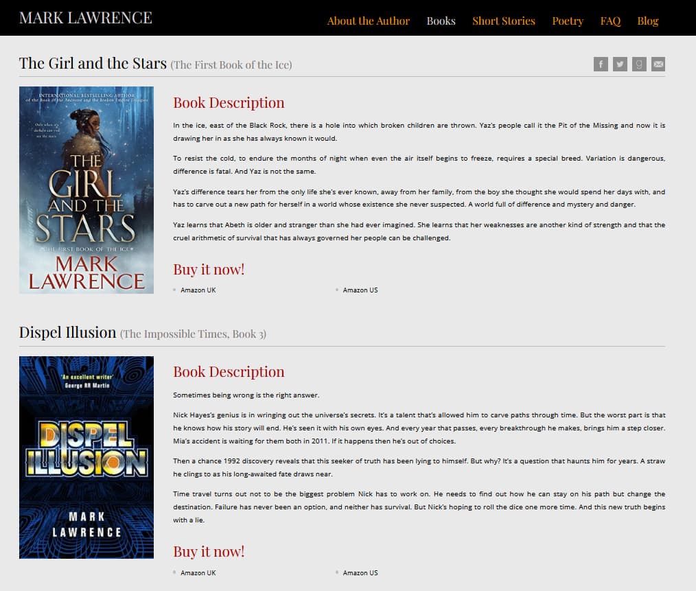
- You can create one landing page for several books in a series. If your book is part of a franchise, then you can hit two (or more!) birds with one stone by making one landing page for the entire series. Mark Lawrence follows this approach on his book landing page, as you can see below.
- You can create one-page sites without any unnecessary extras. Tools like Carrd and Landingi are minimalist one-page website creators that work great for building single landing pages. If you don’t already have an author website, they can help you save time and money compared to more complex website-building tools. However, you may not find them as flexible as full website-building tools as they are designed for basic use.
Final Thoughts
It can be hard to create a book landing page at first, but the end result is definitely worth the effort. By making use of this marketing tool, you’re sure to gain more curious eyes on your book than you would have otherwise. In the long run, all this effort converts to a better reputation as a dedicated author and, in turn, more leads and book sales.
Do you have any particular examples of book landing pages that you love or find impressive? Tell us all about them in the comments section below!
.
Read More
How to Make a Book Trailer in 6 Simple Steps

