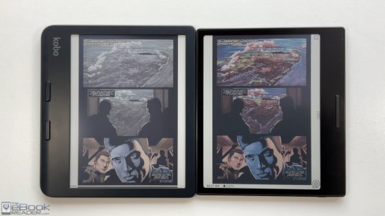
Onyx released the Boox Go Color 7 earlier this month, and the Kobo Libra Colour was released two months ago, so naturally some people are wondering how they compare.
Both devices use the same 7″ color E Ink screen, and both share a similar design with page buttons on one side of the screen. The Boox Go Color 7 is a little more expensive at $249, whereas the Kobo Libra Colour sells for $219, but the Boox adds a lot of extra features for $30.
The main difference is the fact the Go Color 7 runs Android 12 and comes with Google Play for installing apps, so you can have the Kindle app, Kobo app, KOReader app, and dozens of other reading apps installed, among other things.
The Android OS is also a lot more customizable, and Onyx offers a gazillion settings to navigate and set the device up a multitude of different ways.
On the downside, that can all be rather confusing if you’re coming from a more basic device like a Kobo or a Kindle, and Android apps are always glitchier and less optimized than dedicated ereaders like Kindles and Kobos.
Color Screen Differences
One of the first things that jumps out when comparing the Boox Go Color with the Libra Colour is the fact that the screen looks more colorful on the Boox. Comparing the same comics, colors are more subdued and less vibrant on the Kobo.
I’ve come to the conclusion the Boox exaggerates colors a lot, and sometimes it even shows color when there is no color, so overall the accuracy is not good, but it actually looks better that way most of time given the dull nature of color E Ink. Kobo should offer a way to enhance colors too (FYI, changing the CFA mode is an option on Kobos but it still doesn’t get close to the Boox).
Boox Go Color 7 Advantages
- The screen is more colorful than the Libra Colour, but colors are less accurate because of it.
- Android 12 OS adds lots of extra features and support for installing apps.
- Adds microSD card slot.
- More storage space (64GB) and RAM (4GB).
- Adds speaker and microphone.
- Adds support for text-to-speech.
- USB supports OTG.
- Smaller and thinner overall size.
- Buttons are user-configurable for short press and long press.
- Gesture-based navigation is faster and smoother.
Kobo Libra Colour Advantages
- Better native ebook app when it comes to reading ebooks with DRM.
- Adds stylus support and notetaking features.
- Waterproof.
- Simple UI that’s easier to learn and understand.
- Better onboard ebook store, with support for OverDrive built-in.
- Less prone to ghosting.
- Battery life seems better.
- More reading focused.
- Can install a few apps like KOReader, and there are a number of hacks at MobileRead.
For more details check the full Kobo Libra Color Review and the Boox Go Color 7 Review (pending).
Video: Boox Go Color vs Libra Colour
It’s hard to look past all the cool extra features the Boox Go Color 7 has over the Kobo Libra Colour, plus the fact the screen looks more colorful, but the Libra Colour adds stylus support and I still feel like Kobos are better pure ereaders than Onyx’s devices.
The native Boox app has a ton of features, and is way better at some things, but it doesn’t support ebooks with DRM, and the onboard Boox ebook store is a joke. Being able to install apps is a nice workaround for that, but Android apps don’t run as smoothly because they simply aren’t designed for E Ink screens. Nonetheless, having Android opens up a lot more possibilities for the color screen, and Kobo’s color content is rather limited.


